Wise Design Favorites: Our Go-To Whites
- Tamara Wise
- Mar 28, 2019
- 3 min read

This week we are starting a new series on our blog...it's all about our faves! We'll be sharing our preferred picks for lighting, furniture, textiles, wall coverings and more....
Kicking off our new series is a round up of our favorite go-to white paint colors. White walls are definitely having their moment (or all the moments) lately and it's not hard to see why. A white walled room is fresh & light, can be minimal (or not) and provides a great canvas for interesting textures, furniture, art and decor. White walls are classic and modern all at once! However, there are SO many white paint colors and the shade you chose for your space will make a big difference in the feel of the room.

For our residential projects, we love using white paint to instantly brighten the space. It's amazing what a coat of the perfect white paint can do to improve a room. Sure, white paint isn't the perfect solution for every space, but it works for most. The problem is, there are numerous white paints on the market, and they are all different!
image credit: top - Mhari Scott Photography, Bottom -Partee Photography
When we approach paint color in a room, there are many factors we take into consideration - including: age/style of the home, amount of natural/man-made light, use/function of the room and of course clients' personal taste. Another big consideration for choosing a paint color is the existing trim. If we are coming into a space with a painted white trim that cannot be changed, we'll need to choose a paint that coordinates with the trim color.
1920'S BUNGALOW:

Photo Credit: Mhari Scott Photography
As we mentioned before, the style of the home will help inform the decision on paint color. In this cute 1920's Portland Bungalow, we wanted the design to stay true to the era of the home. For the shiplap, trim and main walls of this space, we chose Benjamin Moore
Swiss Coffee, which is a warm off-white color to keep this basement feeling comfy and cozy!
For the upper loft area we contrasted the Swiss Coffee color with Benjamin Moore Intense White, which is a cooler & bright white color.
Left - Swiss Coffee, Right - Intense White
CRAFTSMAN HOMES:

Photo Credit: Mhari Scott Photography
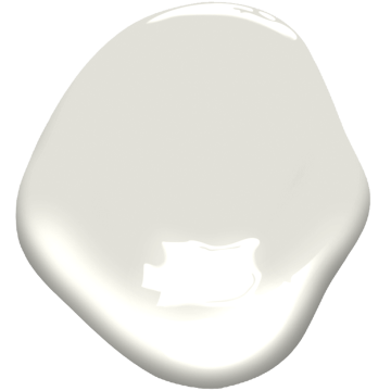
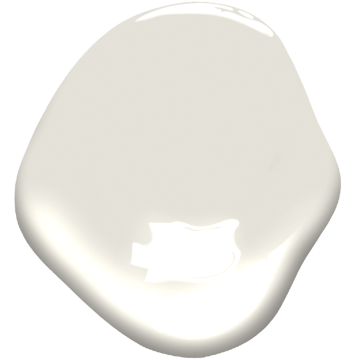
Several of our residential design homes are classic Portland Craftsmen Bungalows. For these historic homes, crisp white paint doesn't always work. For our Alberta Craftsmen project, we chose Benjamin Moore Classic Grey, which is an off-white wall color that felt authentic to the feel of the home. For the trim color, we chose Benjamin Moore White Dove, a slightly greyish white which looks beautiful with the Classic Grey.
Left - Classic Gray, Right - White Dove
MID-CENTURY HOMES:
Photo Credit: Partee Photography
We also work on a lot of Mid-Century homes around the Portland area. We love these homes for their clean lines and open layouts. In our Bridlemile Midcentury project, the walls were already painted a nice shade of white, so we continued the color into the areas we were designing. The paint color featured in this lovely home is Benjamin Moore Cloud White, a soft ethereal white shade. This color was a wonderful neutral base to let the architecture & design in the home really shine! It's a beautiful color!

Cloud White
OUR ULTIMATE GO-TO WHITE:
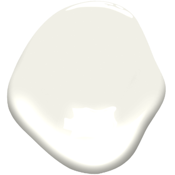
For many Mid Century homes (and other homes too), our paint pick is what we like to call "our go-to white". It's the Goldilocks white...not too cool, not too warm and it's definitely our most favorite white paint color of all time! It doesn't have any weird blue, yellow or pink tints in it, just beautiful pure white! That color is (drumroll please....) Benjamin Moore Chantilly Lace!

Chantilly Lace
This color looks amazing in almost any space, especially Mid Century homes! Time and time again, we turn to this color to deliver just the right amount of warmth and brightness to whatever space we are designing, be it residential or commercial. In our Ranch Mid Century Modern home, Chantilly Lace was the perfect shade to highlight the tall ceilings and MCM details of the home.

Wise Design Office - Chantilly Lace, Photo: Partee Photography
Chantilly lace is not only the perfect for Mid Century Modern homes, it lends itself to commercial spaces as well. We chose this paint color to brighten our own office walls and provide a neutral backdrop for our pinup space.
Stay tuned next week when we bring you a round-up our favorite light fixtures!
#white #whitepaint #BenjaminMoore #whitewall #whitetrim #whitewalls #whiteonwhite #favorite #anniewiseinteriordesign #modernclassic #portlandremodel #pacificnorthwestdesign #interiordesign #oregoninteriordesign #interiordesignportland #portlandinteriordesign #craftsmen #bungalow #bungalowremodel #midcentury #midcenturymodern #bridlemilemidcentury


